AI Analytics
Browse and filter ready-made and custom dashboards and widgets, and ask the AI to build a widget from a plain-language request, in the beta AI Analytics workspace.
AI Analytics, marked BETA in the left-hand menu, is a workspace of dashboards built from widgets: charts, tables and single-figure metrics about your machines. Pulsar provides a set of pre-built ones, and you can ask the AI to build new widgets by describing what you want to see, such as "OEE by shift last week". It has two tabs, Dashboards and Widgets.
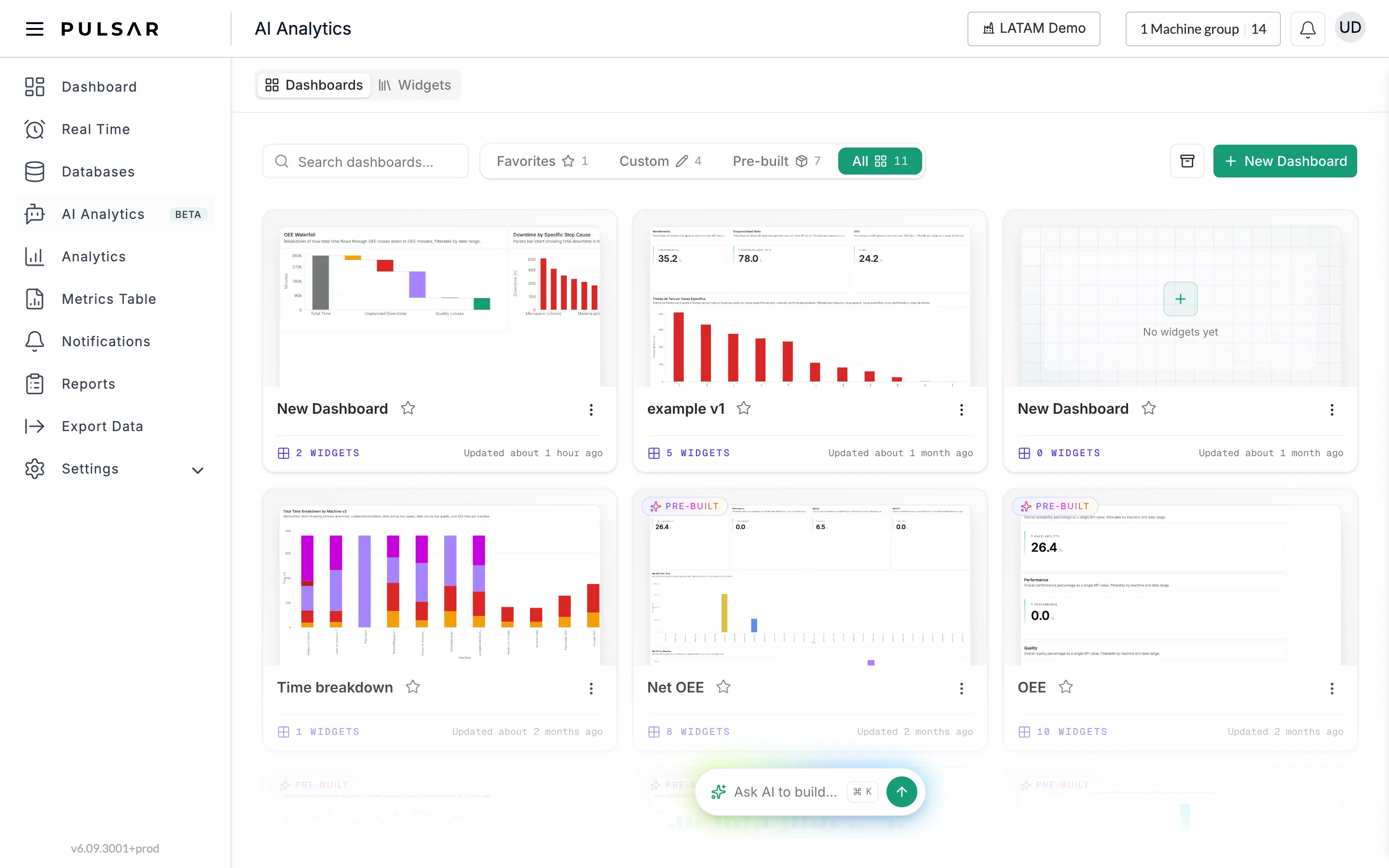
Browse dashboards
On the Dashboards tab:
- Search dashboards... finds a dashboard by name.
- Favorites, Custom, Pre-built and All filter the list, each with its count. Pre-built dashboards come with Pulsar and carry a PRE-BUILT badge; Custom ones were made in your account.
- The star on a card adds it to, or removes it from, your Favorites.
- The three dots on a card open its actions: Clone to customize on a pre-built dashboard, Edit and Archive on a custom one.
- The box button next to New Dashboard opens the archived dashboards.
Click a card to open the dashboard.
Read a dashboard
An open dashboard shows its name, its number of widgets and when it was updated, with a back arrow to the list. The three buttons at the top right are Fullscreen, Download PDF and Clone to customize.
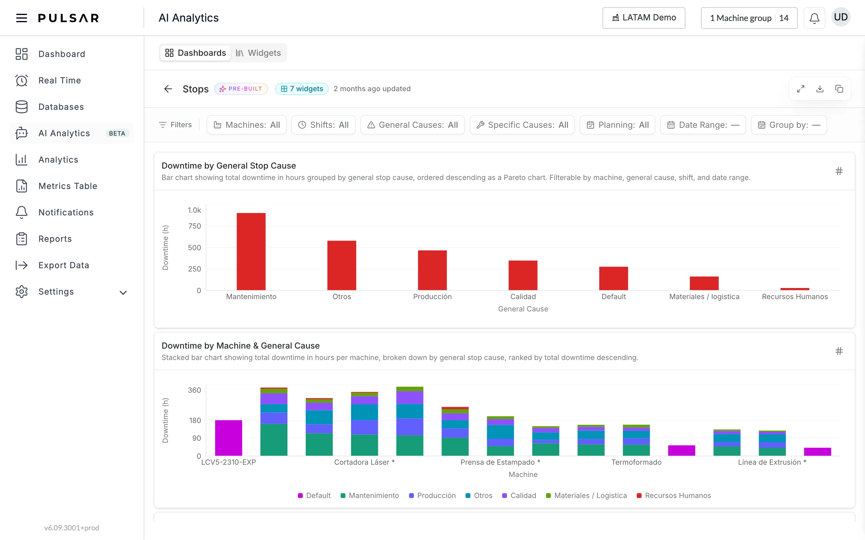
Filters narrows every widget on the dashboard at once: Machines, Shifts, General Causes, Specific Causes, Planning, Date Range and Group by. Each widget has a title and a sentence describing what it shows.
Browse widgets
The Widgets tab lists every widget on its own, with the same Favorites, Custom, Pre-built and All filters, plus:
- Search widgets... to find one by name
- Metric: Downtime / Uptime, Availability, Products, Performance, Quality or OEE
- Type: All, Charts, Tables or Metrics
Each card shows the widget's name, its type (CHARTS, TABLES…) and when it was updated.
Ask the AI to build a widget
Click Ask AI to build... at the bottom of the page, or press ⌘ K. The box opens in the middle of the screen, with suggestions underneath such as OEE by shift last week, Availability per machine per day this month and Quality per SKU for last month.
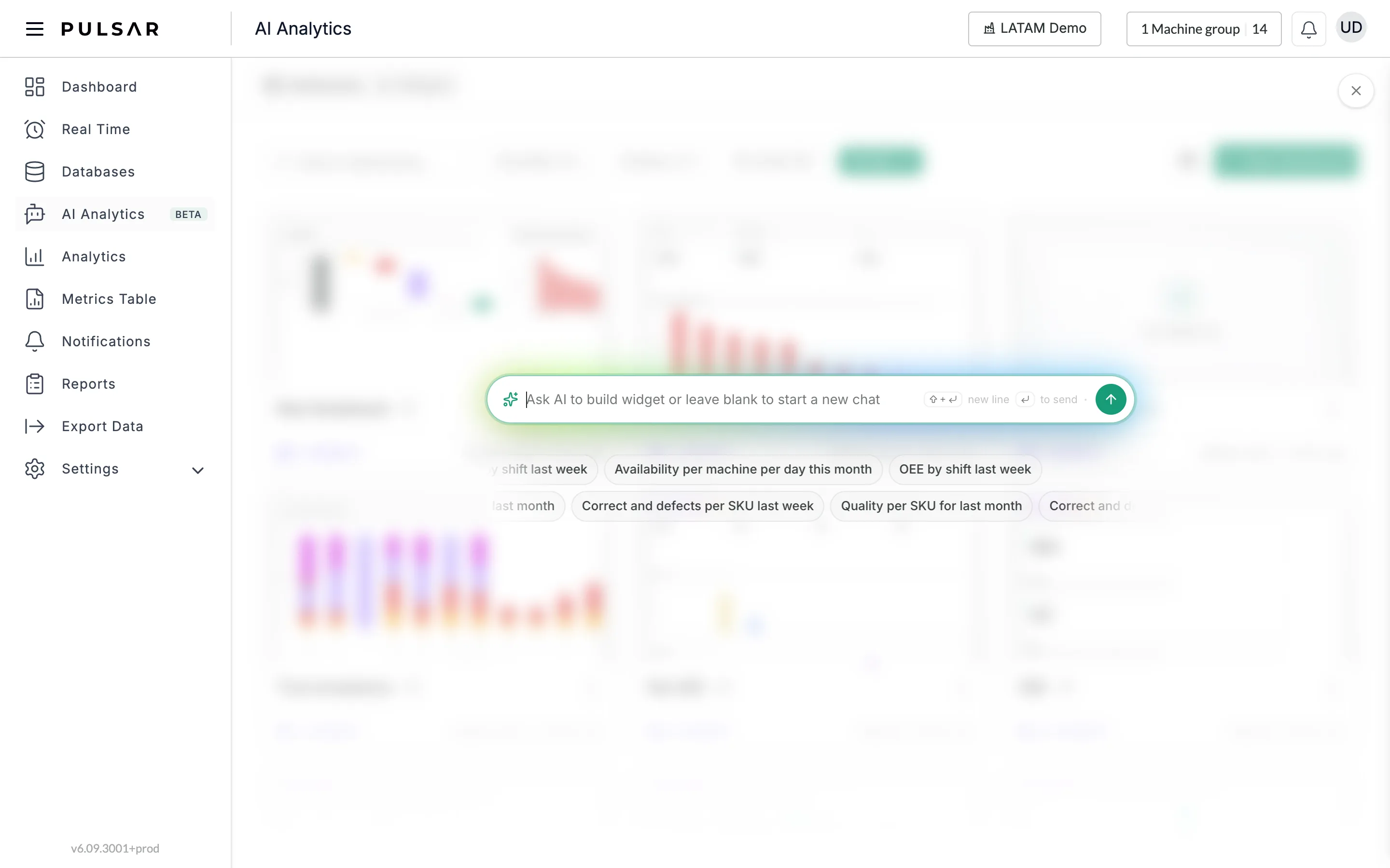
Type what you want to see, or leave it blank to start a new chat, and press Enter or the send button. Shift + Enter adds a new line. The X at the top right closes the box.