Analytics
View your plant's availability, stops, production, speed and OEE in charts and paretos, and download the data or the charts.
Pulsar makes it easy to analyze the information its sensors collect, so you can spot areas for improvement in your plant accurately and in time. In the Analytics module you see this information as charts and pareto diagrams.
View a chart
Open Analytics
Click Analytics in the left-hand menu.
Find the chart
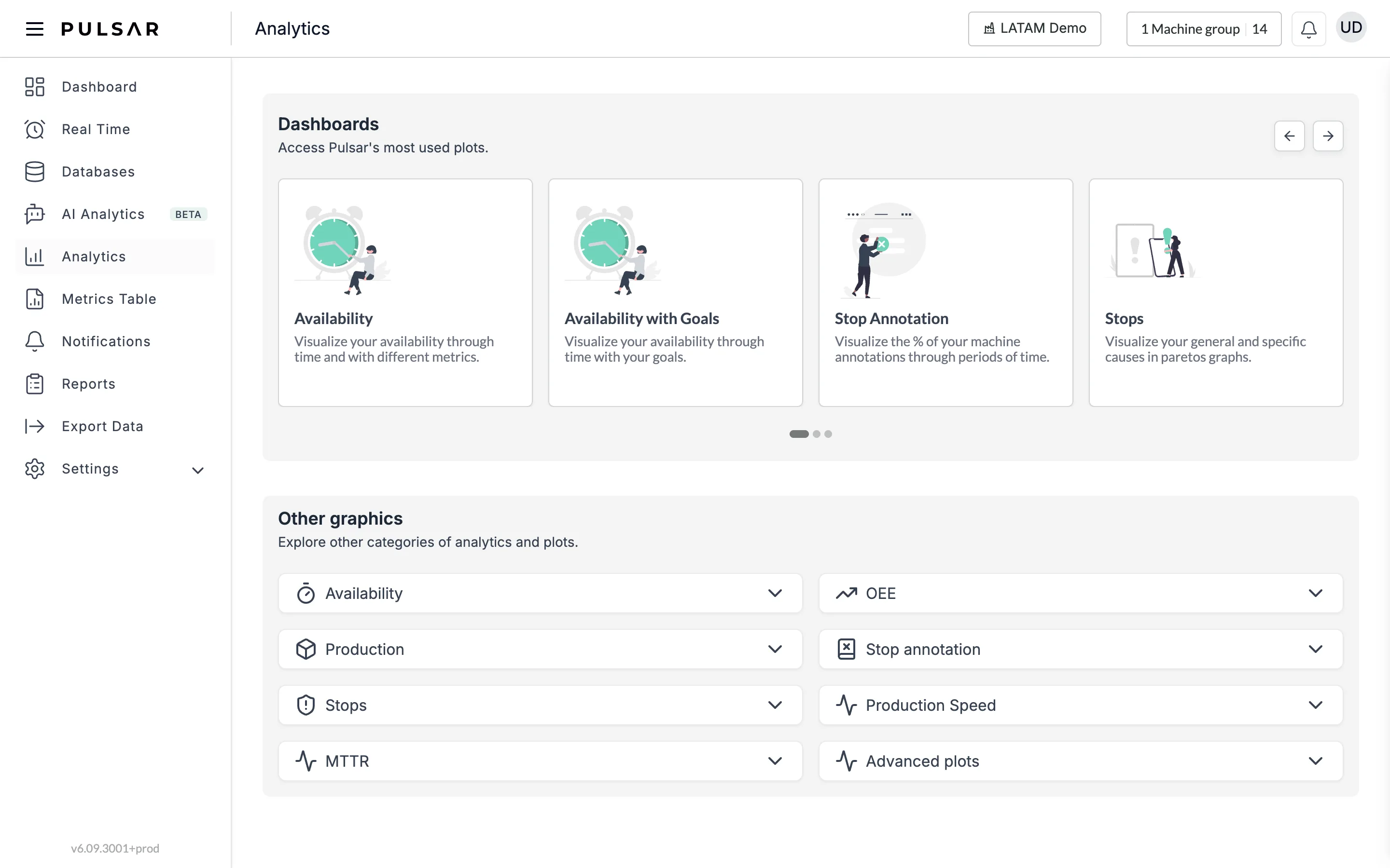
Find the chart you want under Dashboards, Pulsar's most used plots (use the arrows at the top right to scroll through them), or under Other graphics, where the charts are grouped by category. Click a category to expand its list of charts.
Set the filters
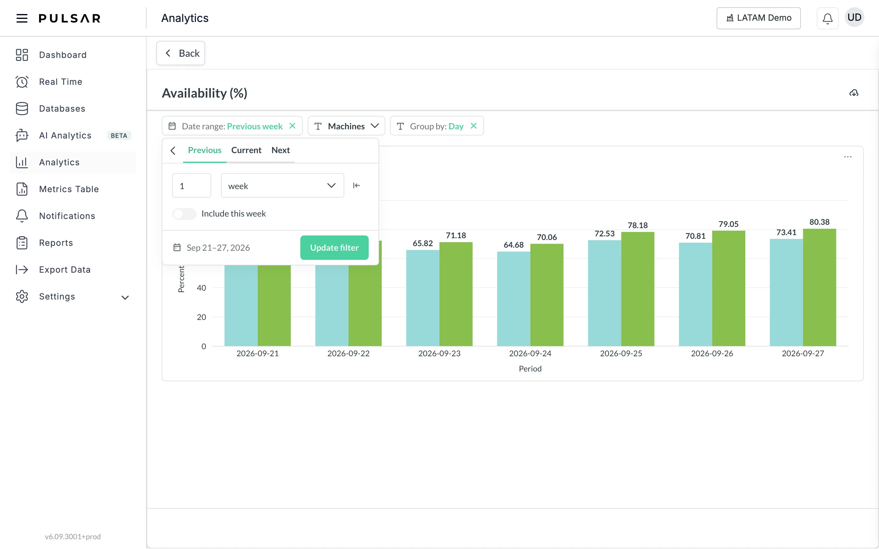
Each chart opens on its own page, with its filters above it, such as Date range, Machines and Group by (Day, Week, Month or Shift). The filters available depend on the chart. Click Back to return to the list.
In Date range, choose Previous, Current or Next, and a number of days, weeks or months.
After changing the date range, click Update filter to apply it.
Dashboards
The Dashboards carousel has these dashboards: Availability, Availability with Goals, Stop Annotation, Stops, Planned Downtime, Maintenance, Production, Production speed, OEE, Defects, OEE Net and Production - Per Shift.
Chart categories
Under Other graphics, the charts are grouped into these categories:
- Availability: the percentage of the total shift time that was productive, overall, by machine and over time, including net availability and availability against your goals.
- OEE: Availability × Performance × Quality, and net OEE, over time and by machine, SKU and operator, plus the OEE breakdown and lost time.
- Production: the pieces recorded per operator, machine, shift and SKU, defects, and daily production by hour or interval.
- Stop annotation: the percentage, quantity and time of stops that were classified with the causes in your stop catalog, over time and by machine.
- Stops: the general and specific causes of the recorded stops in paretos and over time, planned downtime that was exceeded, average planned downtime and stop causes by operator.
- Production Speed: the production speed over time and per machine, SKU and operator.
- MTTR: the mean stop time over time and per specific cause, and the MTBF per specific cause and over time.
- Advanced plots: Historical analysis, Pareto for Stops and Pareto for Machines.
With the app in Spanish, an extra Energía category also appears, with an energy consumption chart (Consumo de Energía).
Download data and images
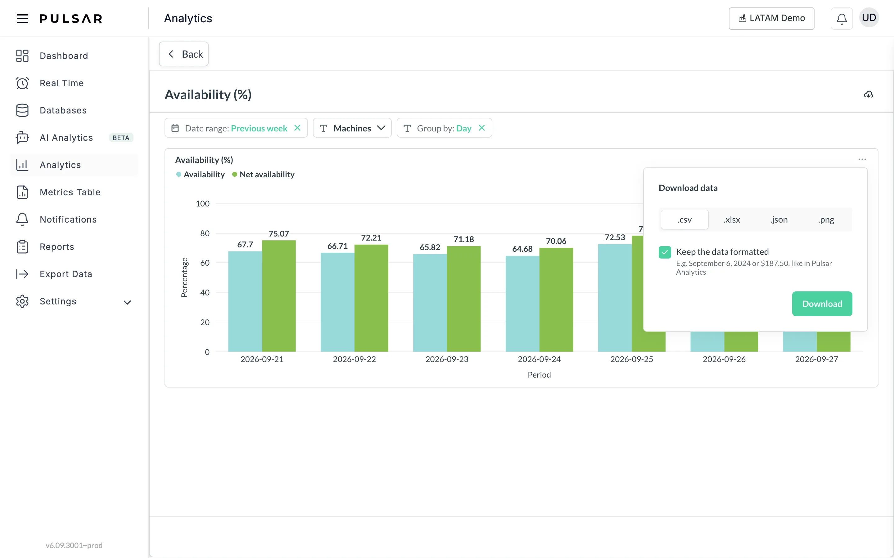
To download a chart's data or image for your reports and presentations, click the three dots at the top right of the chart, then Download results. In the Download data panel, choose a format and click Download:
- .csv: the data as a table.
- .xlsx: the data as an Excel spreadsheet.
- .json: the data as a list, for exchanging information with other applications.
- .png: the chart as an image.
Leave Keep the data formatted checked to keep dates and numbers as Analytics shows them (for example, September 6, 2024 or $187.50).
To download the whole page as a PDF, click the download icon at the top right of the page, next to the chart's title (Download as PDF).
The time shown in the charts depends on each machine's scheduled shift hours.
If you have trouble with Analytics or need help, contact your Customer Success representative or raise a support ticket from the app.
AI Analytics
Browse and filter ready-made and custom dashboards and widgets, and ask the AI to build a widget from a plain-language request, in the beta AI Analytics workspace.
Metrics table
View the KPIs Pulsar calculates for your shifts in a table, group them by machine, SKU, operator, shift and period, and download the table.